
University Club Mexico
Brand Redesign
In the face of a fragmented and overcrowded previous visual identity, we were invited to undertake a significant revamp, prioritizing the harmonization and modernization of the University Club México's graphic presence.
The club's prior corporate identity was significantly dispersed with over 15 different graphic signs, 17 logo variations, a palette involving more than 10 colors, and a similar range of fonts. This myriad of visual elements complicated a clear and cohesive identification and diluted the rich history accrued over more than a century.
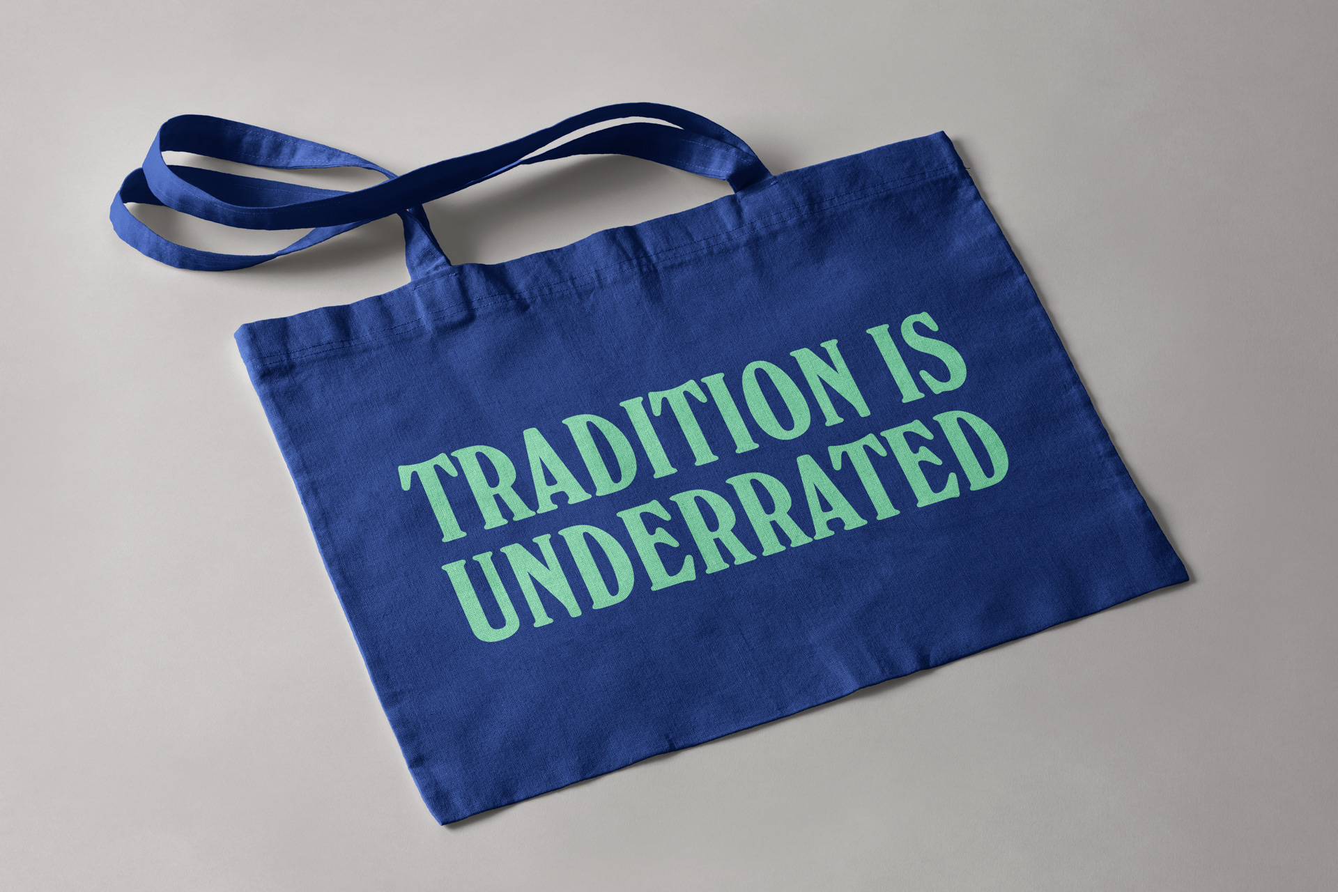
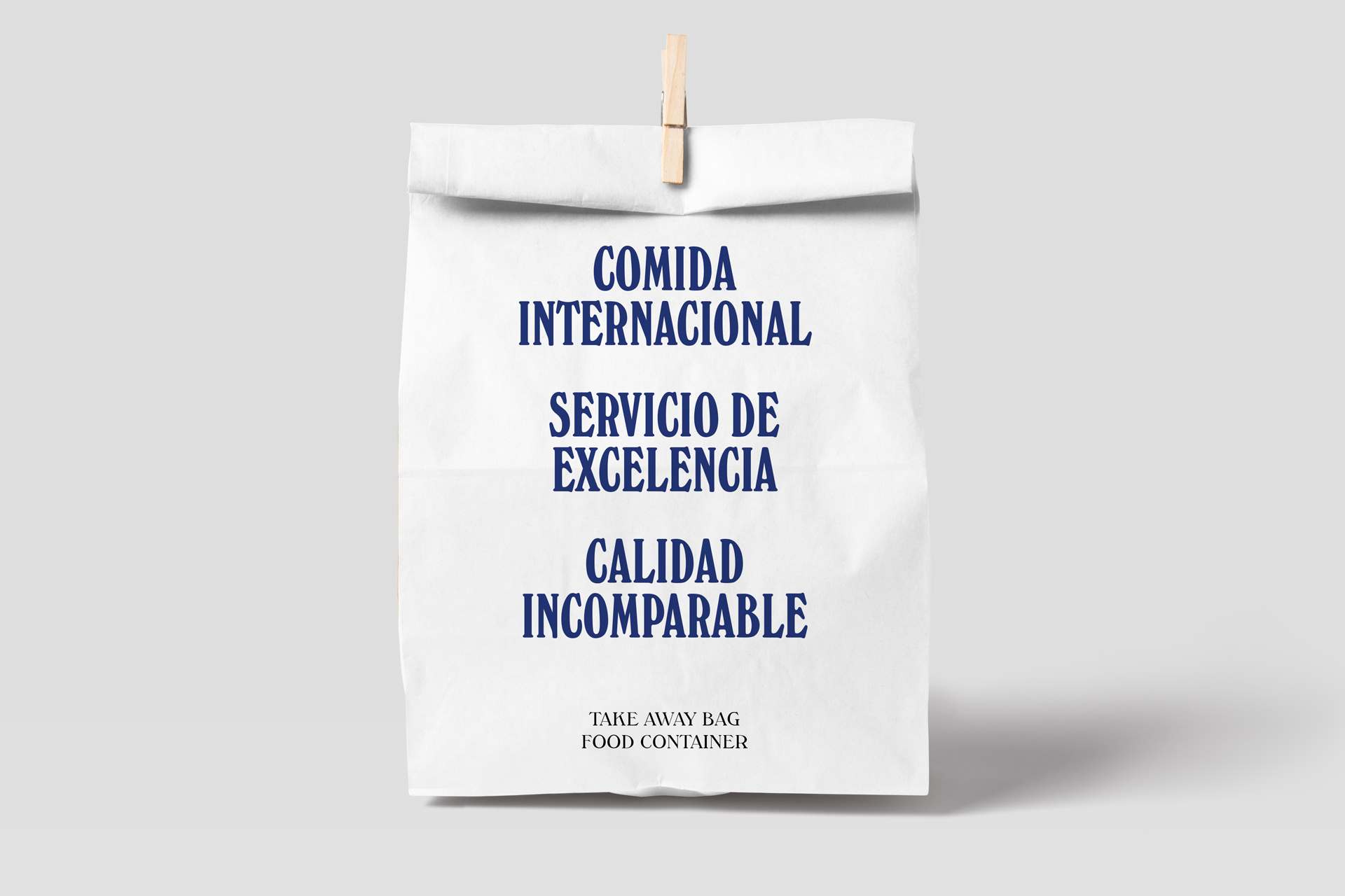
Our Brand Strategy rejuvenates its visual identity while honoring its historical legacy.
Franklin Vargas.
"At the core of this Brand Redesign was the endeavor to craft a fresh image that properly positions the University Club México as a high-quality service catalyst for both the professional community and the broader society. The objective was to echo the club's pivotal role in fostering productive and enriching encounters, all while eyeing a future grounded in growth and enhanced service quality."
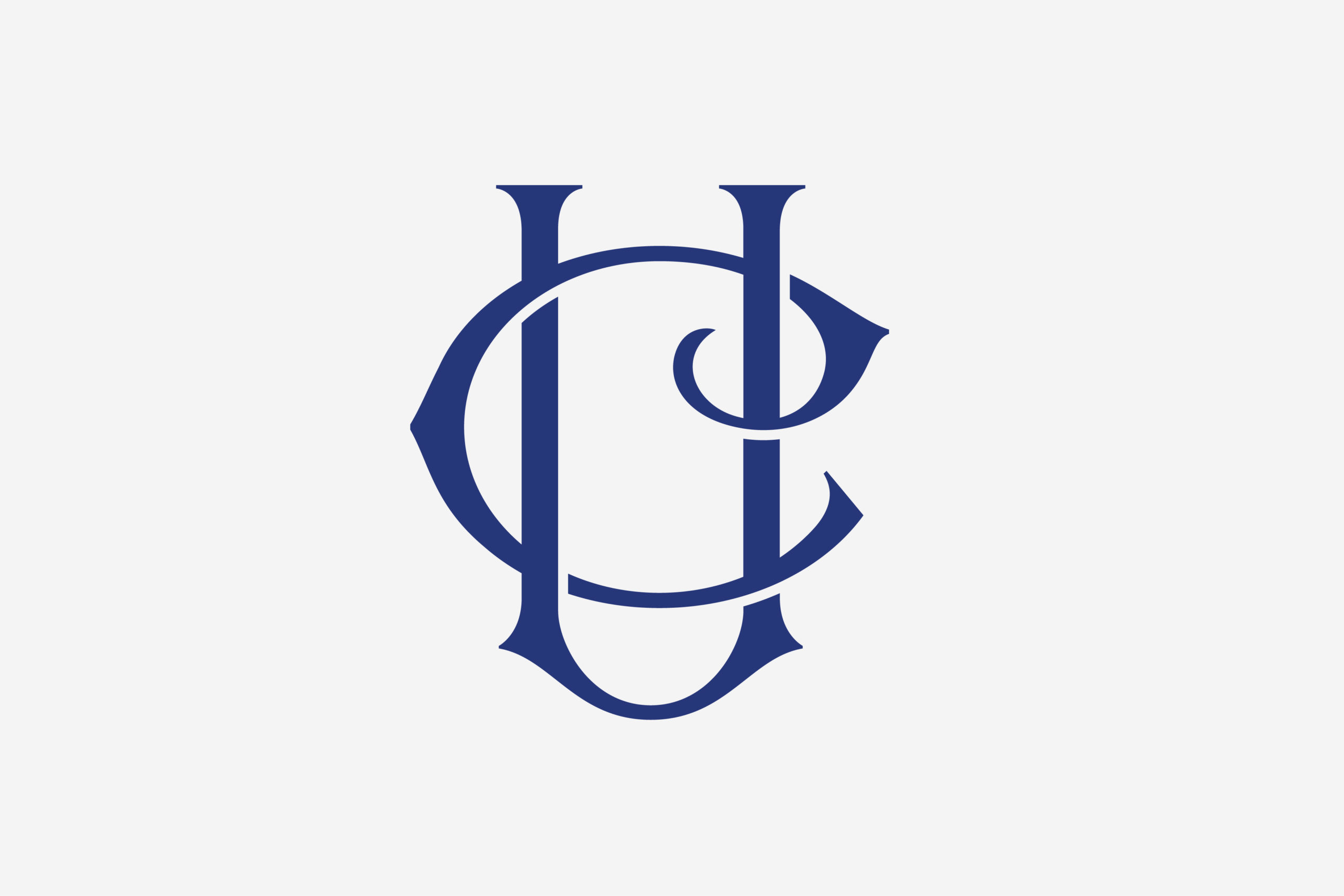
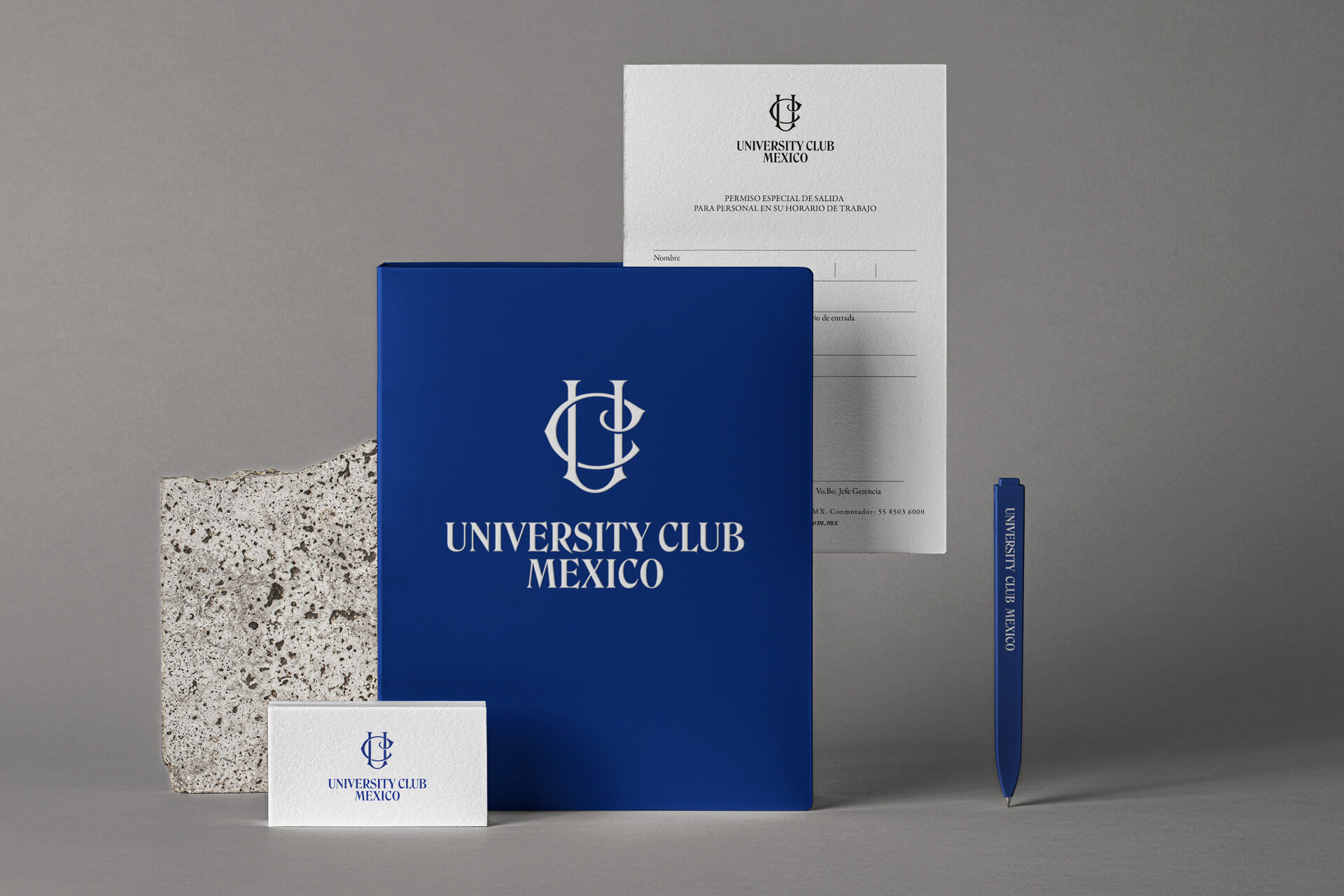
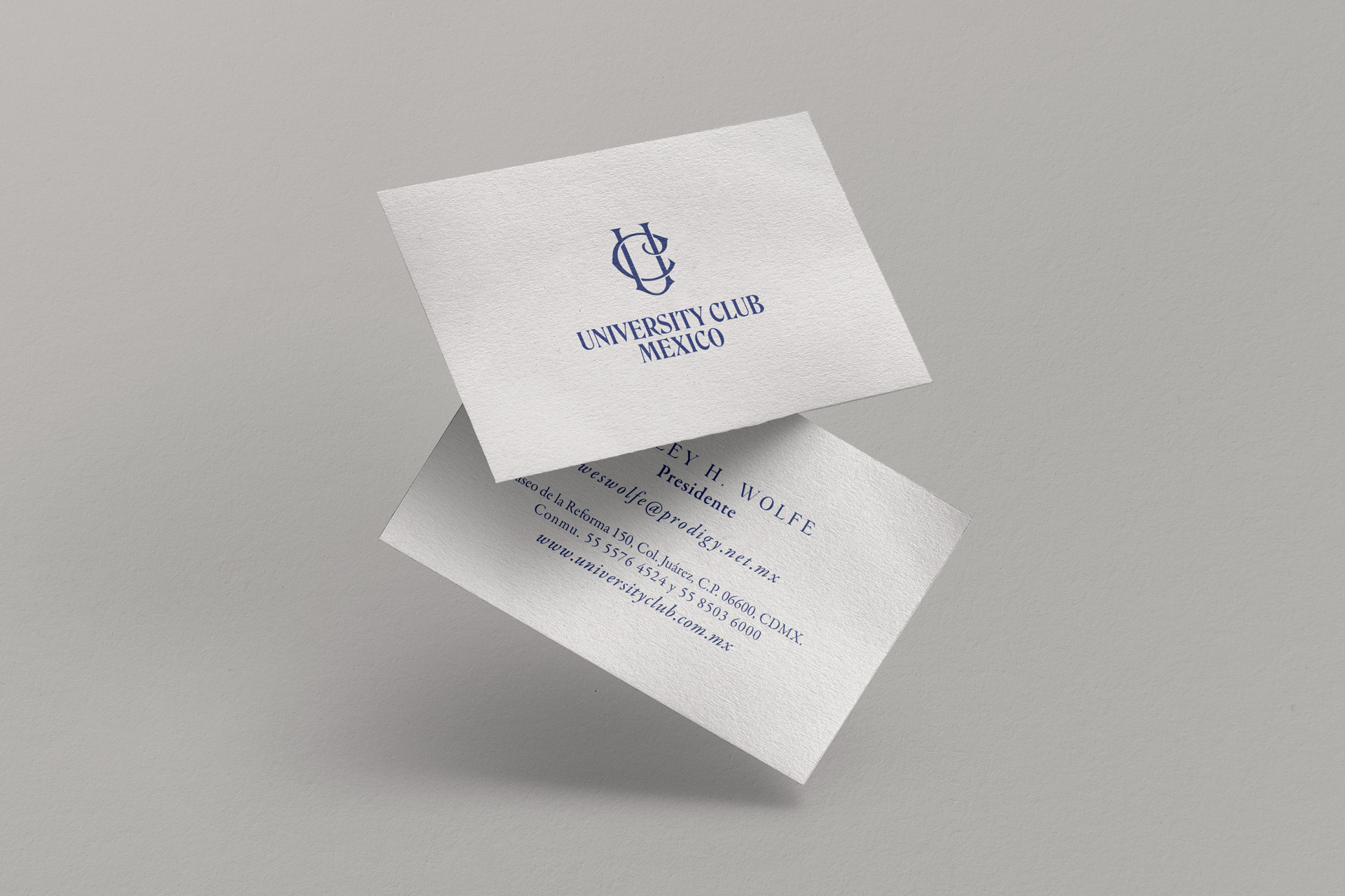
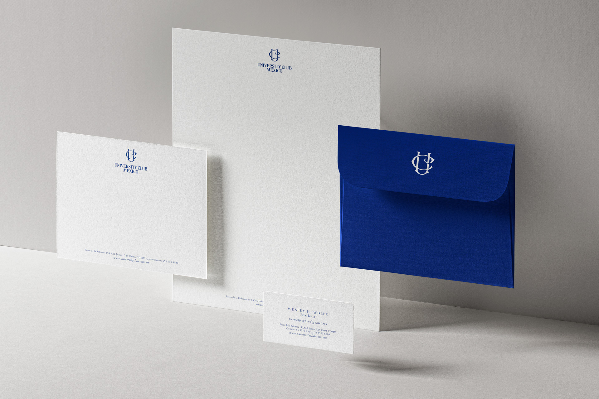
The fresh "UC" graphic sign and the redesigned logo, which harmonizes the sign with refined writing, stand as the hallmarks of this new era. These alterations not only offer a modern and unified visual presentation but also encapsulate the club's mission to remain a privileged meeting point for professionals and society's leaders, resonating with its future sector vision.
This redesign, paying homage to the club’s centenary trajectory, bears witness to the University Club México's dedication to excellence and innovation, promoting a rejuvenated outlook without losing the defining essence carried through the years.