AV Painting
Brand Identity
We carried out the redesign of the Brand Identity and a new communication strategy and its execution, focused on preparing the brand to grow in recognition, the loyalty of current clients, and improve future income in a post-pandemic scenario.


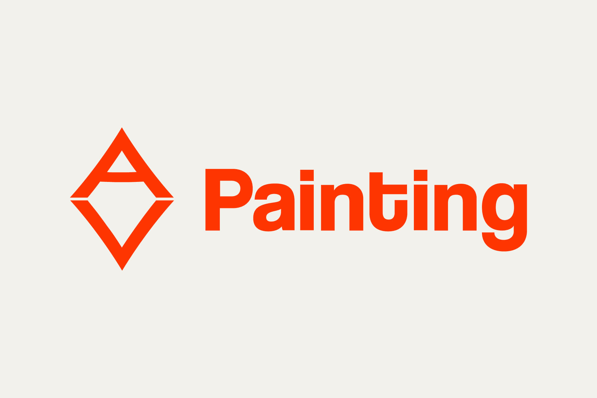
In the mark redesign, we chose to follow the diamond form of the original logotype. We craft bespoke A and V letters to create a stylized yet memorable visual symbol.

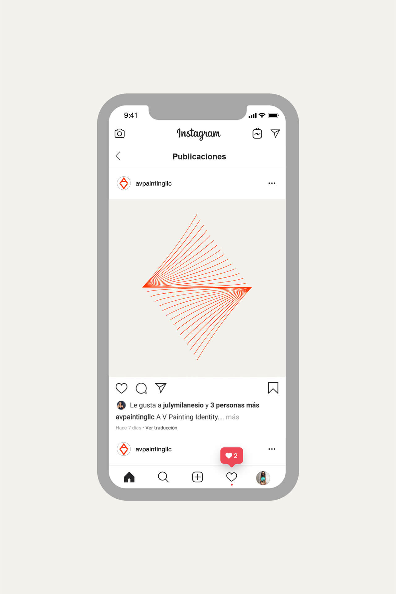
"To set a more stylized tone in our communications and visually closer to our remodeling clients' tastes, we encapsulated in the diamond of our logo lines representing the recommended W-shaped path when correctly painting the walls in a House."
Franklin Vargas.
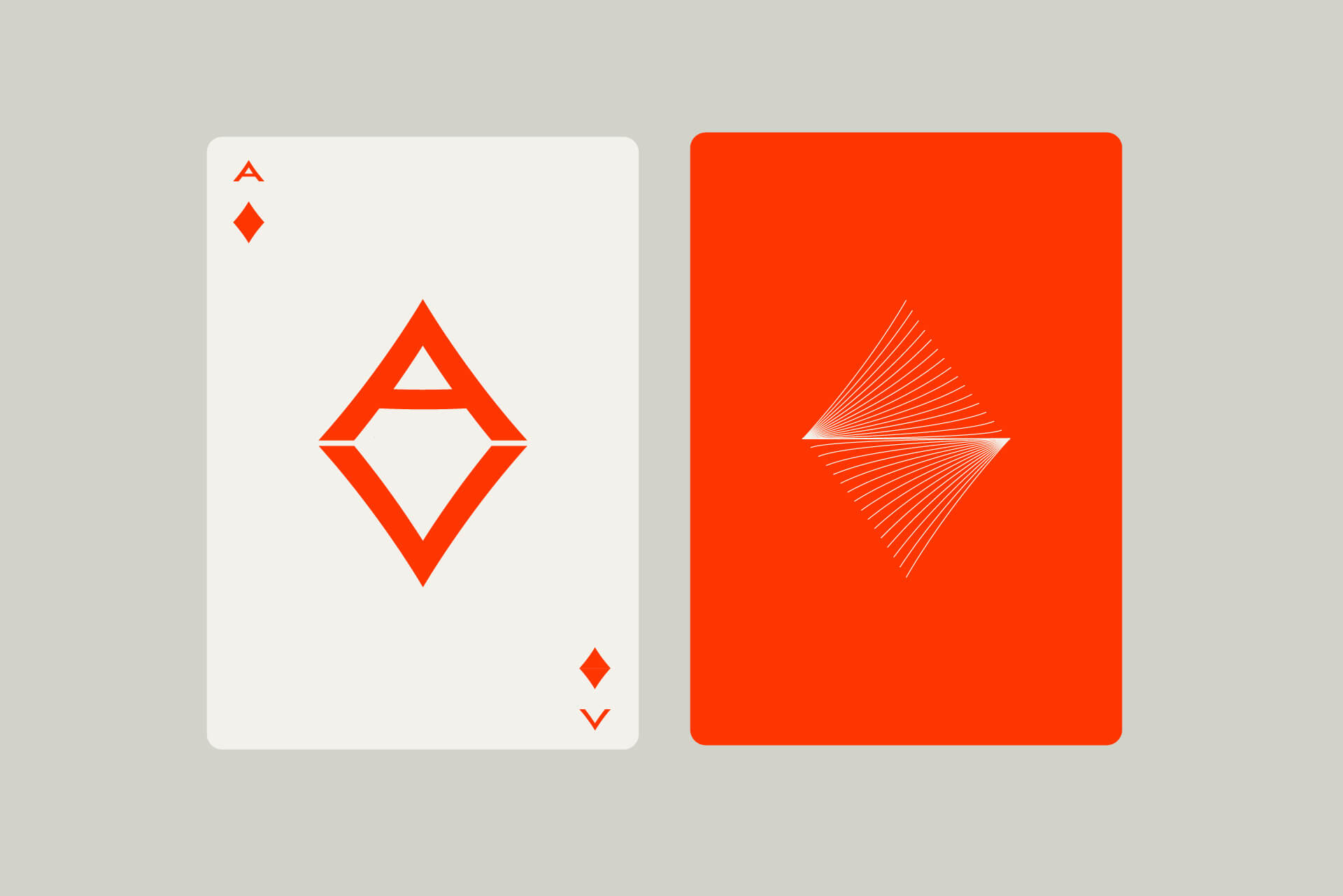
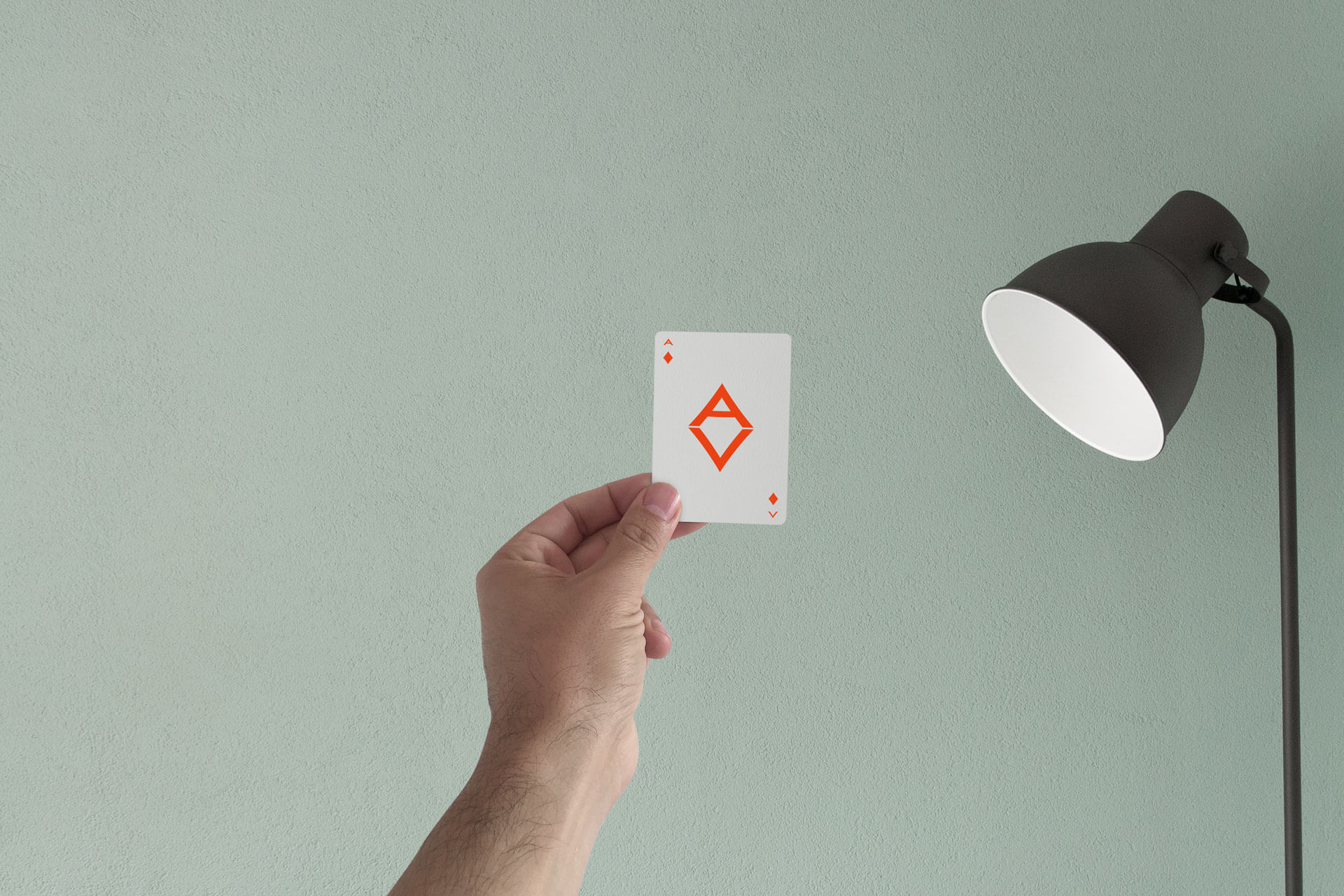
In crafting the mark and other graphic elements, we started to look for a joyful and ludic output for the marketing collaterals. The diamond element for the new identity immediately rises as an Ace symbol. Using play cards like our reference and loyalty cards started to sound great for Arlington and us.
