Quintanilla Architects
Brand Strategy + Execution
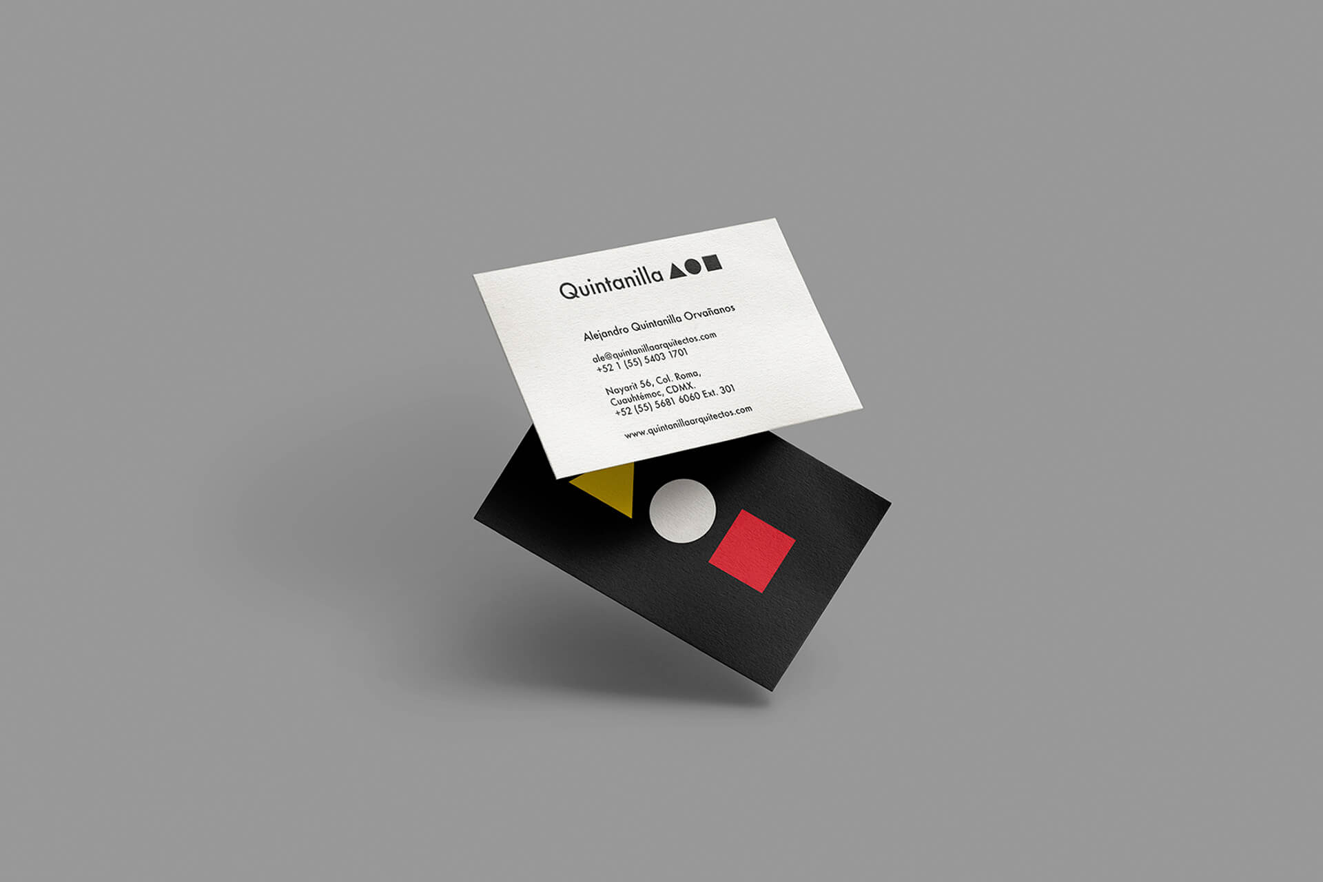
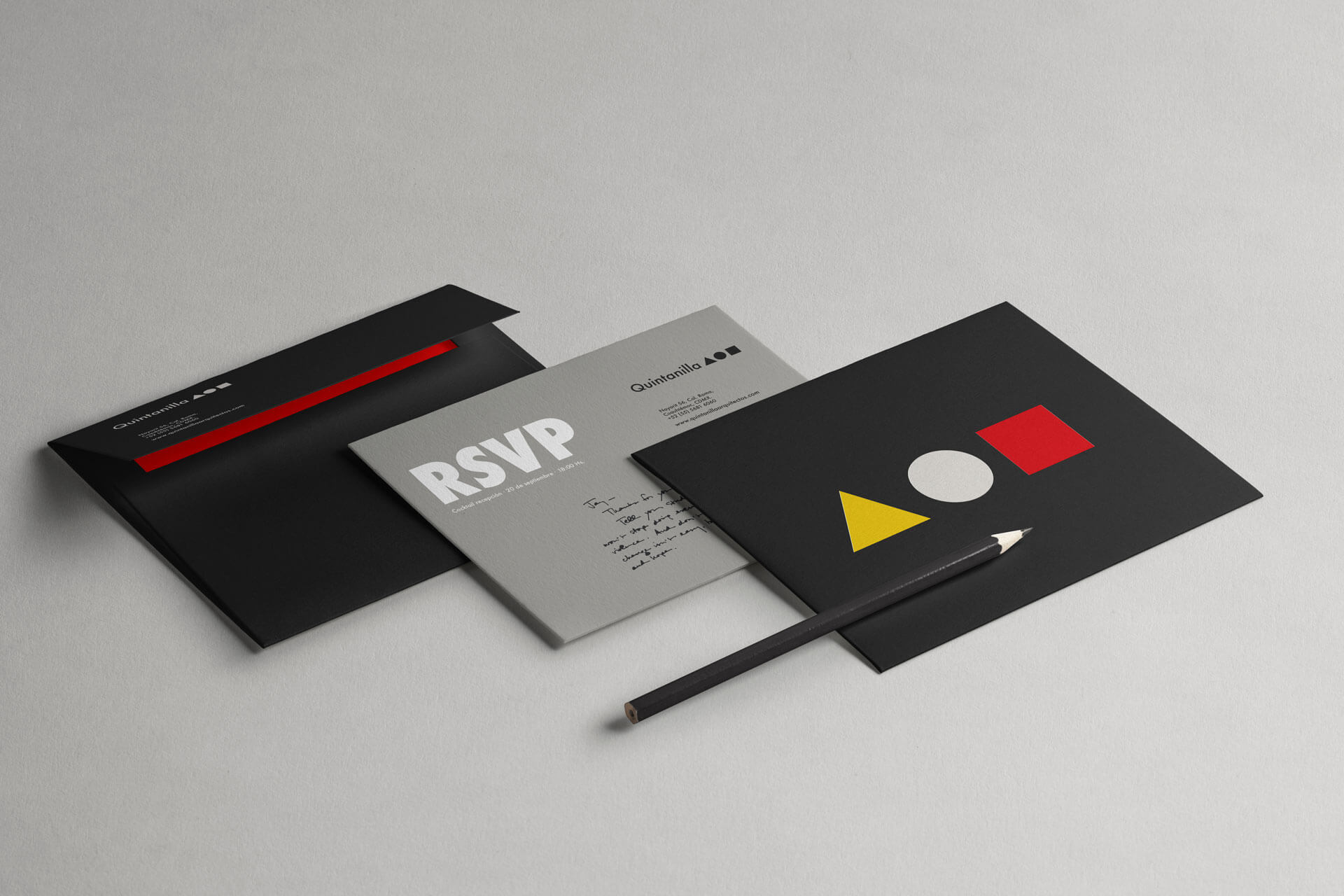
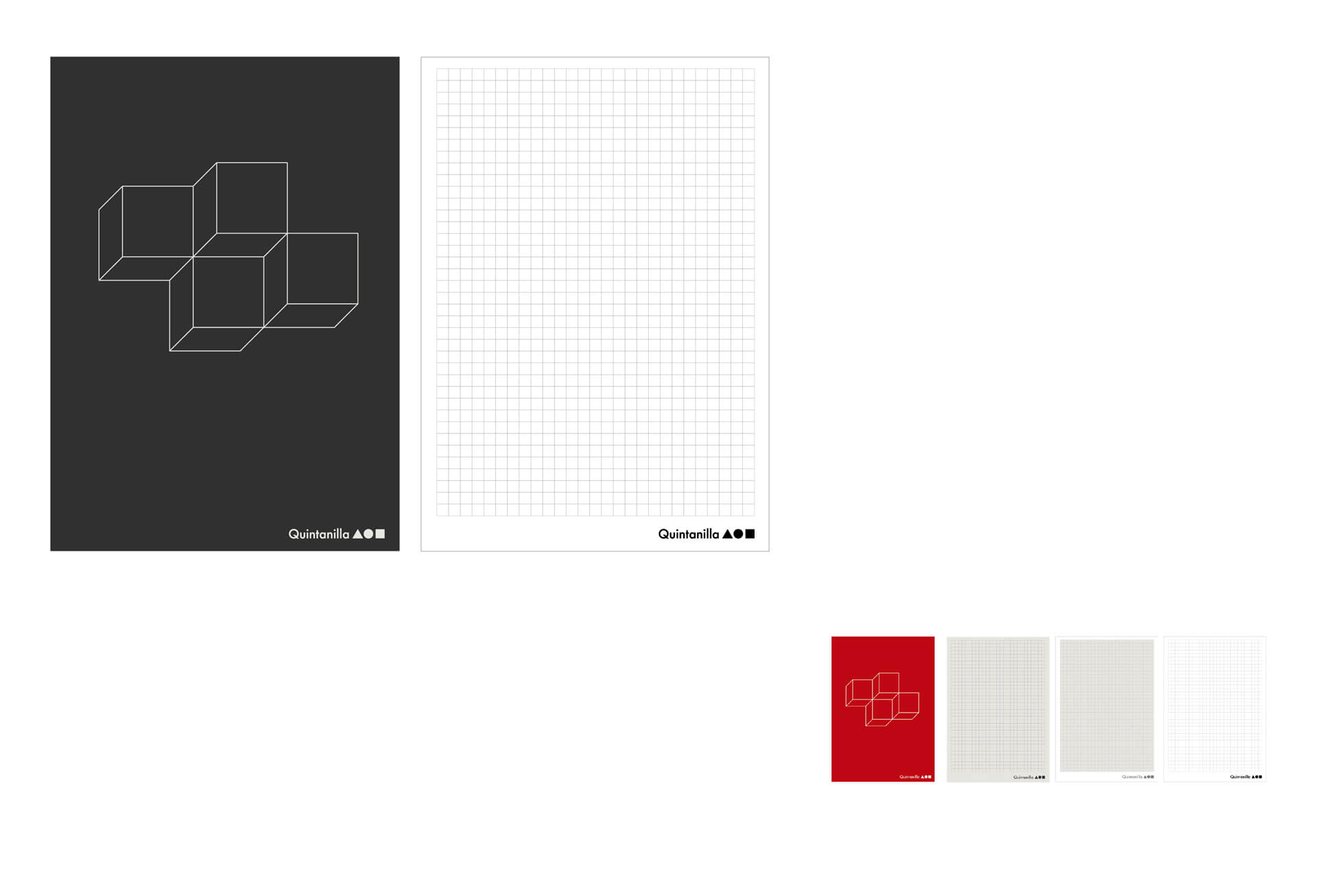
We re-branded the Corporate Identity, visual signs, printed materials, posters, digital applications, and website for the renowned Construction Company on its 40th anniversary.
"Form follows function. It is a functionalist design principle associated with modern architecture and design of the 20th century. Under this premise, we redesigned the visual brand of Quintanilla Arquitectos as a brand system of great versatility and visual impact that prepares the company's communication to face all the growth challenges it has for its future."
Franklin Vargas.
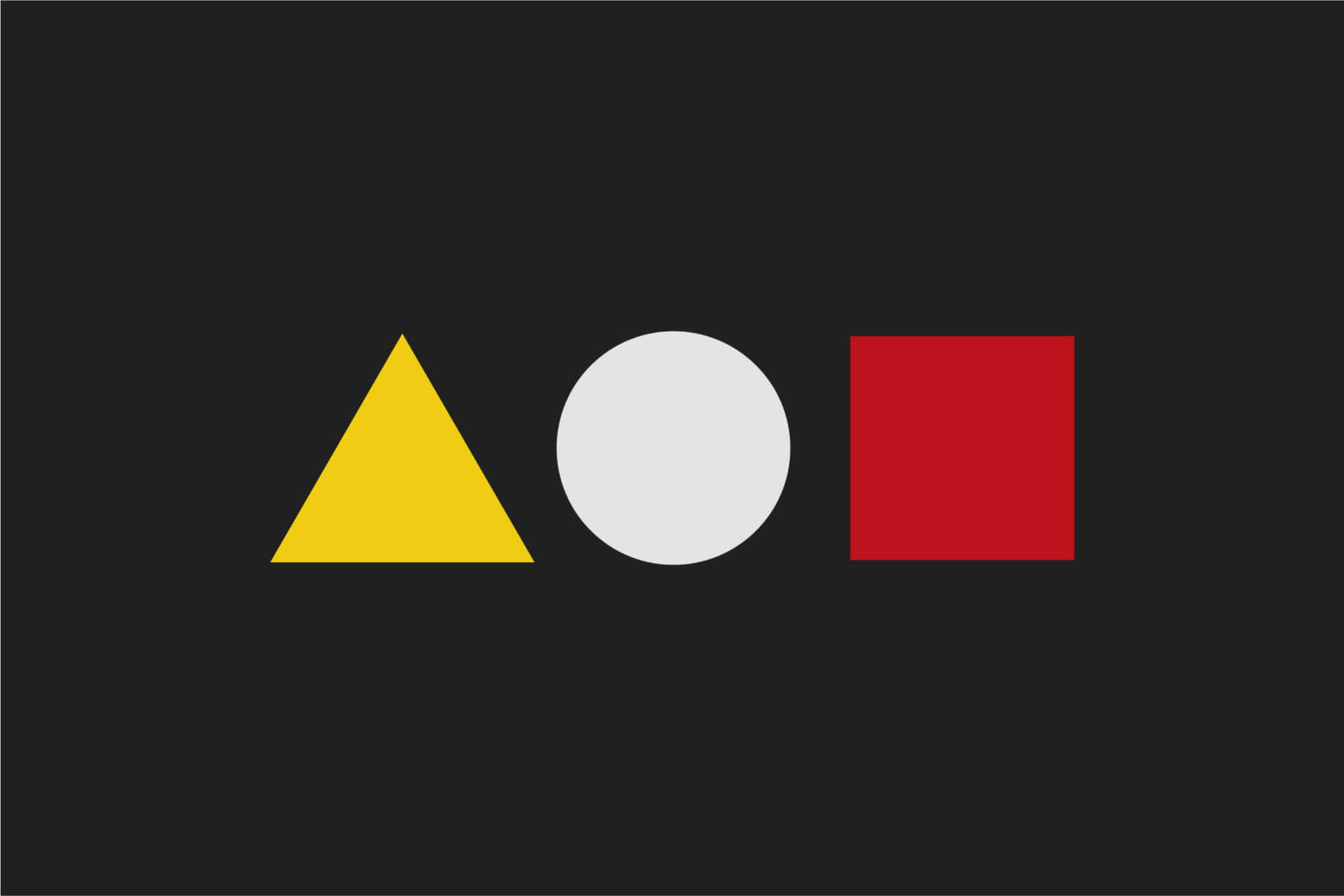


The project bases its visual concept on its three core service areas that wanted to be highlighted in its communication; Architecture, Construction, and Urbanism. It was also an important task to highlight that design had acquired in its business experience, putting Architecture at the offer's front.
